YEAR
2020/21
DELIVERABLES
UX/UI
Visual Design
Development
Animation
Videography
Branding
Cross Device Design
(iOS/Android)
Visual Design
Development
Animation
Videography
Branding
Cross Device Design
(iOS/Android)
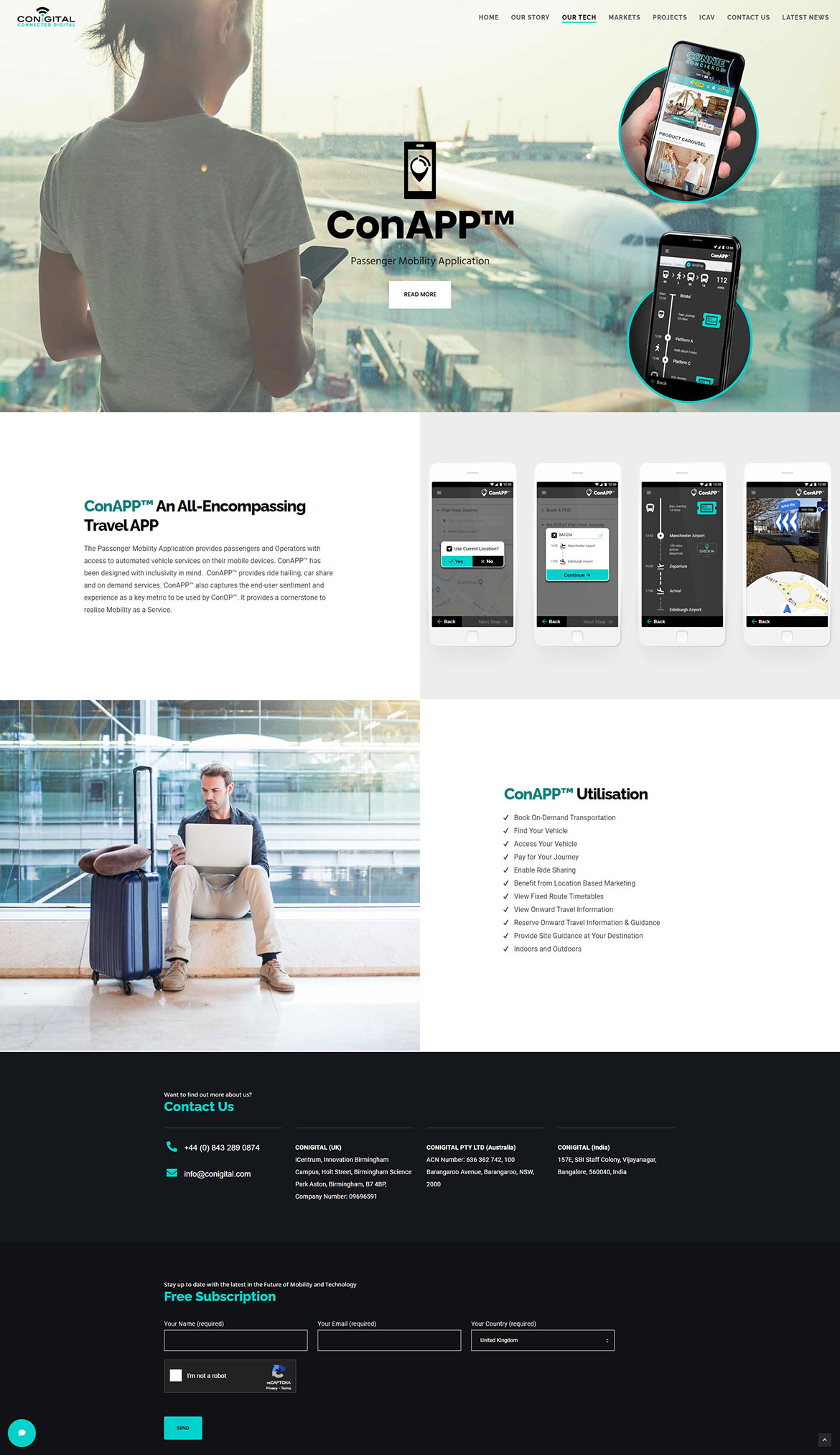
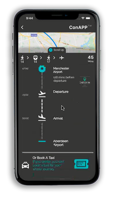
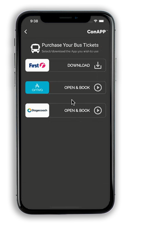
Prototype Mobility as a Service Application; Accessible Mobility for All
The challenge was to create a Mobility as a Service Application that proudly champions accessibility for all. Still in the prototype stage and soon to be released for beta testing; the app is designed to provide users a one stop app that details the users journey, from start to finish. The project has entailed detailing the whole user journey, creating personas through to payment methods. An all-inclusive journey planner; incorporating taxis, buses, trains, planes and even autonomous vehicles.
From inception to prototype
To achieve the initial prototype stage, hours have been spent researching competitor offerings, holding webinars, gathering feedback from stakeholders, creating user journeys, implementing findings… then repeating the process. The app has come along way from the first idea of what an all encompassing mobility as a service app should behave and function.

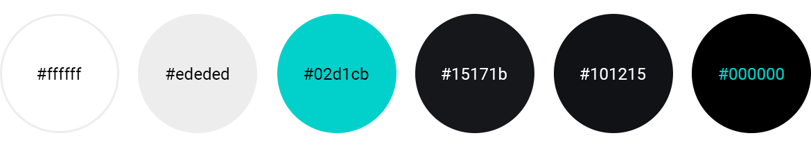
Colour Palette
The colour palette is based on the brand palette for which I designed; focusing on strong colour contrasts to adhere to accessibility regulations, as accessibility is paramount to my design ethos.
BRAND VISION – PROUDLY CREATED BY MYSELF
‘Conigital’ stands for ‘Connected Digital’, proudly echoed in our logo. In itself, It is a broad statement and teaser as to what we offer. As a Deep Tech AI and Optimisation company, we pride ourselves as a driving force for the new digital era; developing cutting edge technologies with optimism, passion, inclusion and perfectionism. This is reflected in our corporate branding utilising three base colours, black, white and teal. Importantly, there is no stronger contrast than black and white for accessibility by design – Accessibility for all is a fundamental part of our entire design process. The strong use of black and white, within the logo, creates a bold platform that echoes our ethos and core beliefs. We are a bold, dynamic company, unafraid to adapt and embrace the ever changing digital landscape. The use of the vibrant teal is a subtle reference to the digital world, a colour that is subconsciously and widely associated with future technology. It deliberately compliments green, a truly powerful colour, promoting subliminal positivity whilst championing environmental issues. The environment needs giant leaps forward to avoid catastrophic climate change, and we are continuously looking for new eco-friendly solutions. Finally, our vibrant teal can happily be teamed with blue, statistically the strongest business colour of all.
As we progress rapidly as a company, we aim to use our three base colours aggressively, making the combination instantly recognisable as Conigital. Our use of bold, sharp lines and shapes optically portraying our brand as the name to trust within an uncertain and fluctuating market; a rock amongst the changing tide. Within corporate documents, we hail a nod to the business world by incorporating varying tones of grey. Furthermore enabling a subtle platform for our core colours to vividly take centre stage, whilst still coalescing.
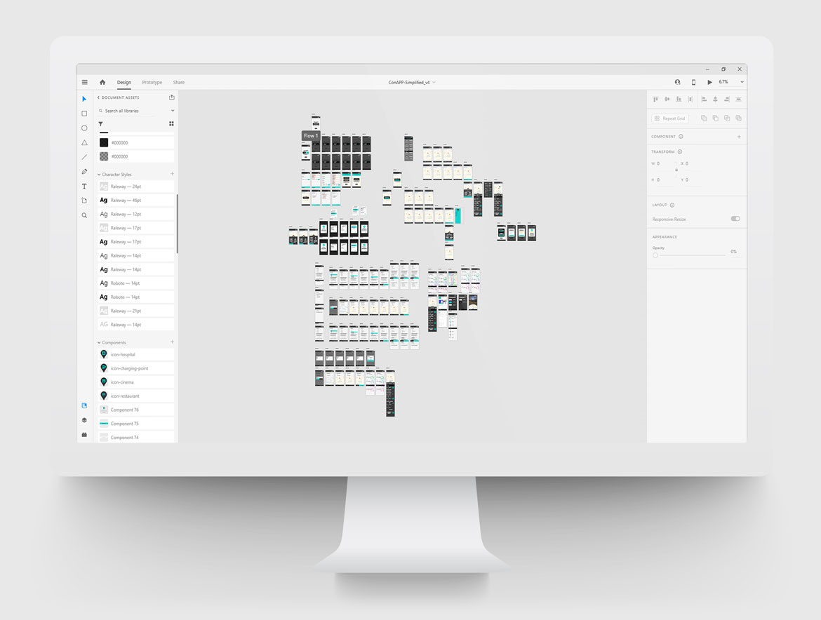
Adobe XD Wireframes
Please wait while flipbook is loading. For more related info, FAQs and issues please refer to DearFlip WordPress Flipbook Plugin Help documentation.
Final MaaS app review documentation outlining the UI changes required by the Developers before the prototype can be released.
Typography