YEAR
2019/20
DELIVERABLES
UX/UI
Visual Design
Branding
Visual Design
Branding
We are on a Mission to Digitally Connect…
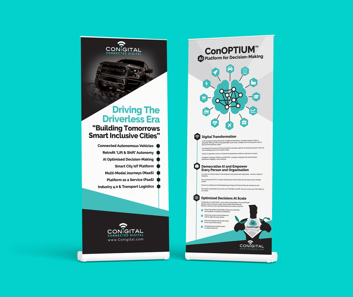
As soon as I joined Conigital, the most obvious problem was that our documentation, brochures, website, pitch decks, one pagers, roller banners and booklets needed perfecting in order to communicate the amazing technology being created, with the wider world.
Getting seen by the outside world…
With an abundance of new innovative technology, the aim was to communicate Conigital’s message and get noticed by bigger companies. As a result of the new branding and marketing material, people started taking notice. Microsoft invited Conigital on to its Co-sell program and are now using the literature I produced and submitted as an example to other companies, who are hoping to join the program, of how to do it properly.
Conigital’s Rollup Banners 2019
Conigital Microsoft Co-sell One Pager 2020
Please wait while flipbook is loading. For more related info, FAQs and issues please refer to DearFlip WordPress Flipbook Plugin Help documentation.
Conigital’s Pitch Deck for Microsoft Co-Sell 2020
Please wait while flipbook is loading. For more related info, FAQs and issues please refer to DearFlip WordPress Flipbook Plugin Help documentation.
Conigital’s ConICAV Product Suite 2020, Created in Word
Please wait while flipbook is loading. For more related info, FAQs and issues please refer to DearFlip WordPress Flipbook Plugin Help documentation.
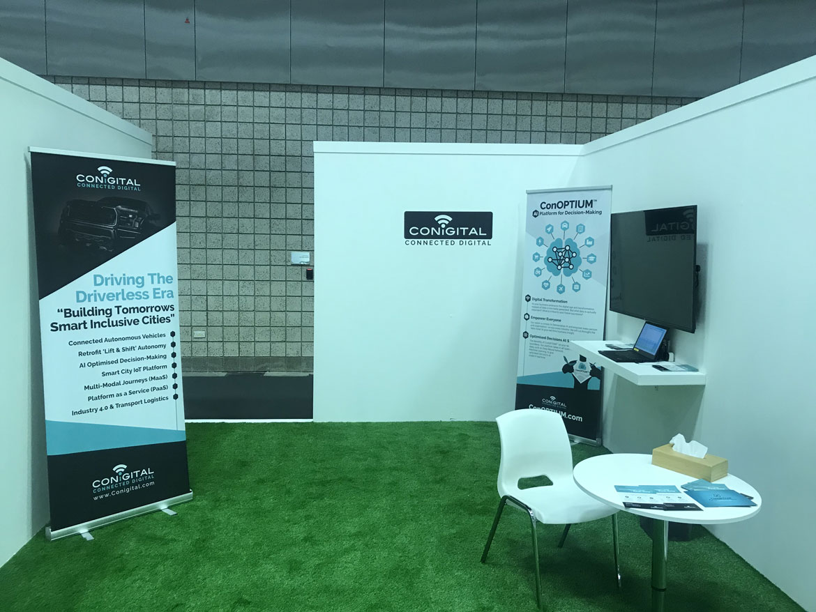
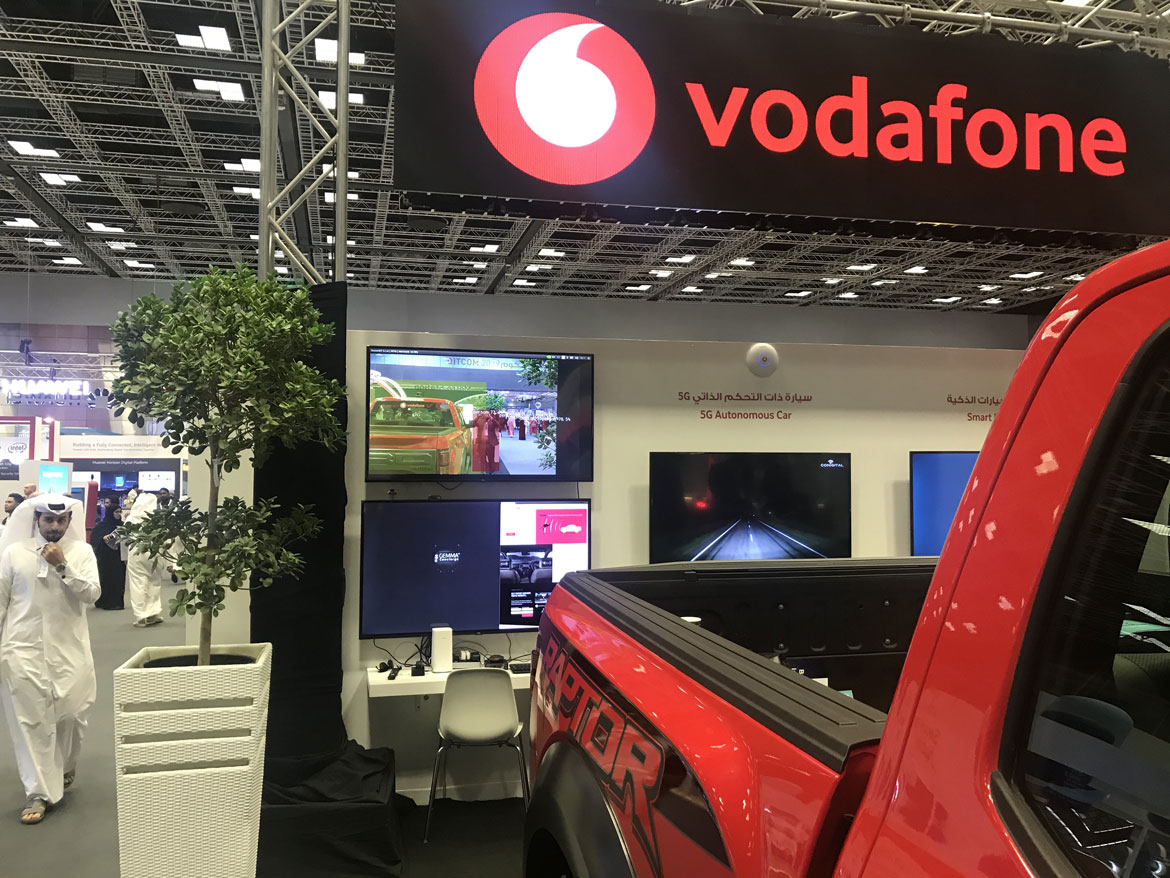
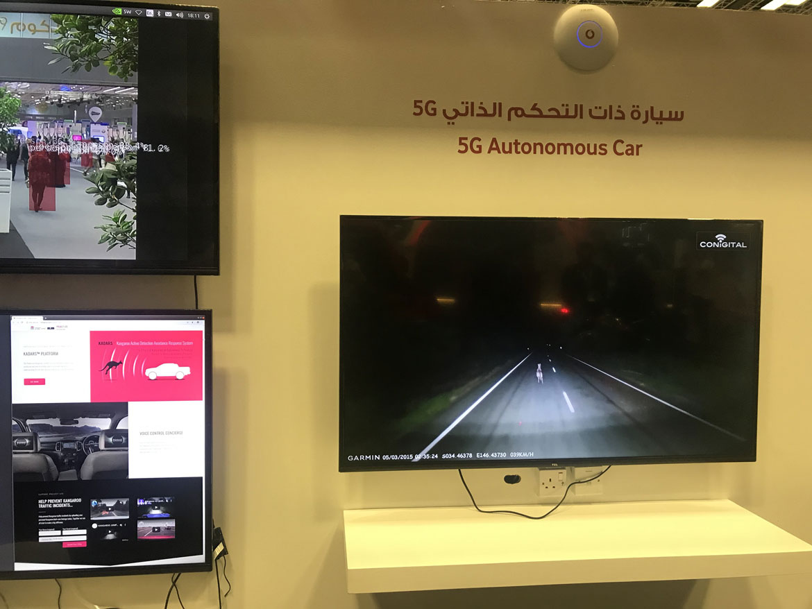
QITCOM 2019
With the newly implemented branding and communication campaign in place, our clear message caught the attention and interest of big companies. As a result, we were adjudged to be in the top five ‘up-and-coming’ AI companies worldwide, according to Vodafone. As a result, we were invited to exhibit at QITCOM 2019 in Qatar, all expenses paid. In turn, our booth played a huge part in Vodafone winning the ‘Best Interactive Stand’ at the host country’s flagship technology conference. I also personally featured in Vodafone’s promotional video of the event.
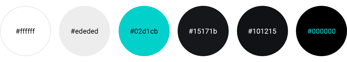
Colour Palette
The colour palette is based on the brand palette for which I designed; focusing on strong colour contrasts to adhere to accessibility regulations, as accessibility is paramount to my design ethos.
BRAND VISION – PROUDLY CREATED BY MYSELF
‘Conigital’ stands for ‘Connected Digital’, proudly echoed in our logo. In itself, It is a broad statement and teaser as to what we offer. As a Deep Tech AI and Optimisation company, we pride ourselves as a driving force for the new digital era; developing cutting edge technologies with optimism, passion, inclusion and perfectionism. This is reflected in our corporate branding utilising three base colours, black, white and teal. Importantly, there is no stronger contrast than black and white for accessibility by design – Accessibility for all is a fundamental part of our entire design process. The strong use of black and white, within the logo, creates a bold platform that echoes our ethos and core beliefs. We are a bold, dynamic company, unafraid to adapt and embrace the ever changing digital landscape. The use of the vibrant teal is a subtle reference to the digital world, a colour that is subconsciously and widely associated with future technology. It deliberately compliments green, a truly powerful colour, promoting subliminal positivity whilst championing environmental issues. The environment needs giant leaps forward to avoid catastrophic climate change, and we are continuously looking for new eco-friendly solutions. Finally, our vibrant teal can happily be teamed with blue, statistically the strongest business colour of all.
As we progress rapidly as a company, we aim to use our three base colours aggressively, making the combination instantly recognisable as Conigital. Our use of bold, sharp lines and shapes optically portraying our brand as the name to trust within an uncertain and fluctuating market; a rock amongst the changing tide. Within corporate documents, we hail a nod to the business world by incorporating varying tones of grey. Furthermore enabling a subtle platform for our core colours to vividly take centre stage, whilst still coalescing.
Typography